If you want to rank high on the SERPs, optimizing your Shopify store for search intent is paramount.
There are four types of search intent - informational, commercial, navigational, and transactional. Each of them is an integral part of the customer journey. This is why it’s essential that you optimize your online store for each type of search intent.
Over the last six weeks, we published three articles dedicated to different types of search intent:
→ How To Optimize Your Shopify Store For Informational Search Intent?
→ How To Optimize Your Shopify Store For Commercial Search Intent?
→ How To Optimize Your Shopify Store For Navigational Search Intent?
Today, we’ll tackle transactional search intent and how you can optimize your store for it.
What you'll learn today
- What is transactional search intent?
- Why optimizing your Shopify store for transactional search intent is important
- How to optimize your Shopify store for transactional search intent?
What is transactional search intent?
When a customer’s query shows transactional search intent, the customer has a very clear intention to buy something, book a flight, or a hotel, make a reservation at a restaurant, and more.
In e-commerce, transactional search queries contain words and phrases like “buy”, “buy online”, “purchase”, “order”, “sale”, “on sale”, “clearance”, “discount”, “coupon code”, “request a quote”, etc. Transactional queries may also include local searches, brand and product names, as well as specific materials (i.e. merino wool, cashmere, porcelain, etc.), or product features and specifications.
Why optimizing your Shopify store for transactional search intent is important
The long and the short of it, when a customer’s query shows transactional search intent, the customer is at the end of the conversion funnel.
All their past actions and queries have led to this moment - they now know that your brand is trustworthy and want to spend money on your products. There is a high chance that they even know exactly which product (or products) they want to purchase.
Therefore, it is essential that you provide a seamless shopping experience, i.e. optimize your Shopify store for transactional search intent.
How to optimize your Shopify store for transactional search intent?
To optimize your Shopify store for transactional search intent, you need to optimize your store for conversions. You can achieve this by following this simple 5-step strategy:
- Optimize your product pages
- Personalize the shopping experience
- Streamline the checkout process
- Make transactions transparent and easy
- Optimize the post-purchase experience
How to optimize your product pages for transactional search intent?
Your product pages are, without a doubt, the pages that have the most (direct) impact on your bottom line. Therefore, you must optimize all your product pages for transactional search intent.
Here's how to do it:
- Optimize the H1 tags (i.e. the title tags) of your product pages
- Organize your product pages in a way that entices customers to buy
- Create high-quality content that adds value to the page (including informative and keyword-rich product descriptions, beautiful product images that showcase the best product features, size chart tables, currency calculators, and more)
- Build trust with relevant reviews and testimonials
How to optimize the title tags of your product pages: Making the case for including the product name in the product page title
Why is it important to include the product name in the product page title?
First, title tags are an important on-page relevancy signal. Therefore, it is essential that you optimize your title tags for search. Note: In Shopify, the title tag and the H1 tag of a page are essentially the same thing.
Second, when a customer is determined to buy a specific product, their queries may contain transactional keywords, i.e. keywords that show buying intent (e.g. buy, order, on sale, coupon, discount, etc.). But they may also type just the name of the product - no extra words added. Therefore, it is important that you include the name of the product in the product page title (i.e. the H1 tag of the product page).
This way, when a customer searches for a specific product you offer (regardless of whether their query contains transactional keywords, or just the product name), its product page will rank higher because Google will know that it is the most relevant search result.
Note: Even though it is important that you include the product name in the product page title, it is essential that you don’t include any transactional keywords. If you do, your product page titles will look spammy and unappealing to customers.
Learn more about title tag optimization → On-page SEO For Shopify: How To Optimize Your Meta Title Tags
How to organize your product pages in a way that entices customers to buy?
We’ve said it before - product pages serve two purposes: point of purchase and social sharing. In our guide to link building tactics that work great right now, we talked about how you can make your product pages more shareable. Today, we’ll talk about how you can make them more enticing.
Take a closer look at this product page: The Laptop Sleeve by SAMARA.
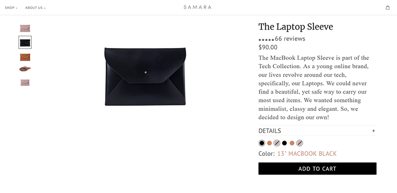
On the left, there is a photo carousel - the photos showcase different product variants and highlight the product features.
In the center of the page, the main focus is on the product photo - when you hover over it, you can view the product in more detail (which is not only a nice touch, but also helps you provide a more informed shopping experience).
On the right, we have the page title: The Laptop Sleeve (note that the H1 tag of the page is the product name).
Then, we see the product rating - when you click on the number of reviews, you jump straight to the reviews section of the page (which facilitates navigation).
Next, we see the price of the product and a short product description which explains why the product was made and, thus, highlights the need for it. Creating and highlighting a need for a product is a great way to optimize your product pages for conversions.
And if the customer wants to learn more about the product features or specifications, they just need to click on Details and a section describing the product in more detail will appear. This section contains information about each product variant’s dimensions, the products each variant was designed for (i.e. the 2018 and later 13" Macbook Air and Macbook Pro, or the 2018 and later 15" Macbook Pro), and highlights some of the most prominent product features (i.e. it fits perfectly inside a tote, it is sustainable, i.e. made from vegan leather and vegan suede, etc.).

Below the Details section, we have the product variants: 13" Macbook (Black, Tan, and Grey) and 15" Macbook (Black, Tan, and Grey). Customers can easily choose the product variant they’re interested in.
Then, we have an “ADD TO CART” button - beautiful design and a clear CTA.
What’s even cooler is that if you choose a product that is currently out of stock, the “ADD TO CART” button becomes an unclickable “SOLD OUT” button. However, a very encouraging and active “JOIN THE WAITLIST” button appears. Which is another great way to maximize conversions.

So far so good. But the above the fold section is not what makes this product page so amazing. Just a scroll away, we see a section that highlights the best product features and a beautiful video that showcases them.

Then, there’s another enticing CTA that encourages customers to convert, followed by a section highlighting one of the product features (“Designed to fit perfectly inside the tote”) and a benefit (“That way, your Laptop fits nice and snug, and your Tote has you looking classy and chic with everything you need within.”).
Next we see an “ADD TO CART” button, followed by a section focused on the environmental impact of the product and a “LEARN MORE” button.

Then there is another “ADD TO CART” button... and if the customer is still not sure whether they want to buy the product, the following two sections are designed to facilitate the buying decision process.
First, there is a section dedicated to showing the product in action - a series of photos that give context and help customers get a better idea of how the product can benefit them and fit into their everyday lives.

Then, there is a reviews section - as a store owner, you already know that reviews are a powerful form of social proof that maximizes conversions. In our guide to optimizing your Shopify store for commercial search intent, we talked a lot about the power of product reviews, as well as how you can leverage them. Learn more → How to Harness The Power Of Product Reviews?

To sum up, this product page is optimized for conversions, because:
- It is extremely detailed and customers can easily discover all the information they need.
- Its H1 tag (i.e. its title tag) contains the name of the product.
- The product photos showcase the best product features. Furthermore, there’s a product video that enhances the experience.
- The product description is clear and concise, yet it provides a ton of valuable information. It highlights the product features and benefits, and creates a need for the product.
- The product’s social impact is highlighted in an engaging manner.
- There is a carousel of photos (of the product in action) that provide context.
- In fact, there are plenty of images (13, to be exact) displaying the product in different scenarios - product photos, photos from photo shoots, photos of people using the product, etc.
- There is a reviews section (and social proof is important for maximizing conversions).
- There’s not 1, but 4 “ADD TO CART” buttons in strategic places across the page.
- If a product is out of stock, the “ADD TO CART” button becomes inactive, but a “JOIN THE WAITLIST” button appears.
- The page layout and design elements ensure customers that the brand is trustworthy and the product has high value. Which means that customers will feel more secure (and, respectively, enticed) to buy.
If you want to go the extra mile and make sure that your product pages are perfectly optimized for conversions (i.e. for transactional search intent), you can:
- Add a size chart - that is, of course, if your product comes in different sizes (i.e. if you sell clothing, child seats, dog collars, furniture, mattresses, bedding, snowboards, skis, etc.). Learn more → How To Optimize Your Product Pages For Navigational Search Intent?
- Include stock and inventory details, i.e. “X items left” product stickers, if a product is currently out of stock, you can include information on when it will be available again, etc.
- Include information about shipping (if you ship your product internationally, it is a good practice to include information on taxes and duties) and delivery options.
- Include a link to your Returns and Exchanges policy.
Learn more about creating outstanding product pages that both search engines and humans love → Shareable products: The future is now

While it is true that your product pages must contain all the important information about the product, it is essential that you keep them concise and to the point. This means that you must provide only valuable information and refrain yourself from going into unnecessary (or, even worse, promotional) details - if something doesn’t need to be said, it is better that you skip it.
It is also important that your store contains only product pages that can convert. This means that, if a product is out of stock, and you’re not planning to offer it again, it is best that you delete its product page. Notice that I said “delete” and not “hide” - if you simply unpublish the page, it may still get crawled by Google, which means that some of your newer product pages may not get crawled as fast (and if they don’t get crawled, they won’t get indexed which will have a negative impact on your bottom line). In other words, deleting the product pages that cannot convert, will help you maximize your Crawl Budget, as well as improve your site loading speed - both of which will lead to higher rankings, which will result in more sales.
And, once you’ve optimized your product pages for conversions, you can move on to step 2 of your transactional search intent optimization strategy - personalizing the shopping experience.
How to personalize the shopping experience?
If you want to succeed in e-commerce, providing seamless shopping experiences is paramount. And personalization is one of the keys to achieving this.
There are many ways to provide shopping experiences tailored to each customer. However, when it comes to on-store optimization for transactional search intent, 3 of the ways stand out:
- Personalized product recommendations
- Tailored product onboarding
- Creating in-store like experiences using immersive technologies like AR and VR
Personalized product recommendations
Personalized product recommendations are based on user behavior and allow you to suggest relevant items (products the customer will express high interest in) at different touchpoints of the shopping experience.
Such items include products that have been frequently bought with the product the customer is interested in and are usually displayed in “Customers who bought this item also bought” or “Frequently bought together” sections.

Source: Amazon
Personalized product recommendations also include products similar to the ones that a customer has already considered buying. Such recommendations are usually displayed in an “Inspired by your browsing history” carousel.

Source: Amazon
But these are just two of the more obvious ways to leverage personalized product recommendations.
If you want to level up your game, you can take a page out of Thinx’s book and their Know Your Flow quiz that is designed to output personalized product recommendations.

Thinx is a feminine hygiene brand that encourages women to reduce their plastic footprint by using a more sustainable alternative to disposable products.
But when it comes to feminine hygiene, the “one size fits all” approach is not applicable. So, personalization is paramount.
To help women find the perfect product, Thinx has created a quiz that takes no more than a few minutes and addresses the questions that will help them get to know their customers (and their consumer needs) better. This enables them to offer each customer the perfect product, as well as deliver a tailored shopping experience.
Once a customer answers all questions (and before they view their results), Thinx uses the opportunity to share a few helpful tips on proper care for their products (which adds extra value and improves the shopping experience).
Then, when customers view their results, they get an overview of how many disposable products they currently use, as well as by how much they could reduce their plastic footprint if they use Thinx for just one year. This gives the product a purpose and creates a sense of community and makes customers feel like they are a part of something bigger - an initiative that will change the world for the better.

Below this section, there is a “show my recommendations” button - when a customer clicks it, they get a list of Thinx products that will be perfect for them and will meet their unique needs. Amazing, right!
Tailored product onboarding: The fun and engaging alternative to an exhaustingly long FAQs page
Say you offer a product that requires you to provide a ton of information - a unique product which is personal by nature; a product that needs to meet each customer’s unique needs.
One brand that offers such products is Chāmpo - a hair care brand with a philosophy based on Doshas (the three substances that are present in a person’s body according to Ayurveda). As you’ve already guessed, buying a product that is so special and has such specific properties requires a ton of research. In other words, in order for customers to choose the right Chāmpo product, they’d need to first educate themselves.
But instead of creating an extensive knowledge base, or a long and exhausting FAQs page, Chāmpo created three beautiful product onboarding experiences to help customers find the perfect product for themselves: The Vata Dosha, The Pitta Dosha, and The Kapha Dosha.

Each of the Doshas has a “Shop” button and a “Learn more” button. We’re currently interested in the “Learn more” button.

So, what happens when we click it?
For example, when we click the “Learn more” button in The Vata Dosha section, we get to meet Naomi.

We get to learn more about her life and hair. She has Vata hair which is “naturally wavy, not too fine and yet not too thick. But it’s unruly. Volume abounds yet it often feels dry and delicate, looks lacklustre and is prone to split ends. This is because Vata hair is dominated by the element of air, meaning natural moisture is hard to hold on to.”
By now, the customer viewing the page will know if this description fits them. If it does, they just need to scroll down and learn more about how they should properly care for their hair, what type of product they should choose, and view all Vata hair products Chāmpo offers.

And if the customer isn’t sure that they have Vata hair, they'll be pleased to find a helpful section at the bottom of the page: “I think I might be more Pitta” and “I think I might be more Kapha” links that can take them to the Pitta or Kapha onboarding experiences.

Aside from being educational, this onboarding experience is also extremely beautiful and personalized. It allows customers to embark on a journey that would not only help them choose the perfect product, but will also add value to their lives and help them get to know themselves a little better. Providing such an experience is a great way to deliver more personalized shopping experiences, as well as increase customer satisfaction (and reduce returns).
Mirroring the in-store experience online
The best way to recreate the in-store customer experience is to use an immersive technology like AR or VR. In order to add AR and VR to your store, you must have 3D models of your products.
Shopify is the first-ever e-commerce platform to natively support 3D models, and AR experiences. Learn more → Video, 3D Modelling and AR. The feature became available to merchants in March, 2020.
What does this mean? It means that Shopify merchants can upload 3D models directly to their product pages and it is just as easy as uploading an image, or a video. No custom code or third-party apps needed.
So, the first question at hand is: How do you create 3D models of your products?
You can do it in-house using photogrammetry or CAD files. You can also use a 3D modeling software like Maya, Blender, ZBrush, Photoshop, or ThreeKit. Before you start, we recommend reading this Shopify guide to 3D modeling. Note that creating the 3D models in-house is a viable option only if you have a 3D artist on your team. And if you don’t, you can outsource it to a Shopify 3D modelling partner like Sayduck or CGTrader.
Once you have figured out how you’ll create 3D models of your products, you can consider adding AR and VR experiences to your Shopify store. We talked a lot about these immersive technologies in our guide to Shopify AR and VR. Learn more → Shopify AR And VR: The Key To Immersive Shopping Experiences
We also talked about the power of 3D models and AR in our guide to the top 4 link building tactics that work great in 2020. Learn more → 4 Link Building Tactics For E-commerce, Shareable Products
Hopefully, these resources will help you gain a better understanding of Shopify AR and VR, what these technologies offer, and how you can make the most of them.
But creating AR/VR experiences can be a costly endeavor. And if you’re on a shoestring budget, embedding them into your Shopify store, can be quite difficult. But even if this is the case, there’s still a way to take advantage of the technology for free - Size.link.

Size link is a free Shopify tool that allows merchants to create size links and enable their customers to view the dimensions of any product in their own space. All the customers need to do is click the link and point their smartphone camera at the surface they’d want to put the product on (or the space they need it to fit in).
Ultimately, size links give your customers a better understanding of how your products would fit into their space (whether that space is their living room, their yard, or the trunk of their cars). Essentially, a size link serves the same purpose as a 3D model rendered in AR, but in a less sophisticated, still very efficient way.
Thus, creating size links and displaying them on your product pages is a great way to maximize conversions (and take product page optimization to a whole new level). And the best part is that, unlike 3D models, creating a size link won’t cost you a thing. This makes AR more accessible and allows small and independent businesses to make the most of it.
Size.link Helps Shoppers Visualize Product Dimensions in AR
Learn more on how to create and use size links → Size.link Helps Customers Visualize The Size Of Your Products In Their Own Space
How to streamline the checkout process?
Optimizing the checkout process is essential for providing better shopping experiences and maximizing conversions. So, the question at hand is: How can you streamline the checkout process?
The answer is simple: Leverage Shop Pay. Shop Pay (previously known as Shopify Pay) is Shopify’s accelerated checkout method that is used by over 40M shoppers across the globe.

Shop Pay ensures faster and secure checkouts. This is because customers can save their shipping, billing, and credit card information for future purchases. They just need to enter their phone number and opt in to Shop Pay.
Then, placing an order using Shop Pay is as easy as clicking a button, and entering a 6-digit code (that customers receive in a text message) on the checkout page. Learn more about how Shop Pay checkouts work → Shop Pay, Customer Experience
Perhaps, the biggest advantage of Shop Pay is that it is connected to the Shopify ecosystem. This means that if a customer has already opted in to Shop Pay (and completed the SMS verification) on any Shopify store, their information will be securely stored (on Shopify’s PCI compliant servers) and they’ll be able to check out much faster on other stores that also have Shop Pay enabled.
In addition, Shop Pay is the first-ever carbon-neutral way to pay. Learn more → Offset your delivery emissions with Shop Pay

According to Shopify Financial Solutions, Shop Pay:
- Speeds up the checkout process by 4x
- Increases checkout conversions by 1.72x (average checkout-to-order rate)
Important note: In order to enable Shop Pay, you must use Shopify Payments. Check if you meet the requirements → Shopify Payments Requirements
Learn more:
- Shop Pay Is The Fastest And Best-Converting Checkout Experience On The Internet
- Shop Pay Documentation - learn which languages are supported and how to enable and disable Shop Pay
- Shop Pay Help
How to make transactions transparent and easy?
Transparent transactions are an integral part of an optimized (for conversions) checkout. So, how can you make transactions transparent?
First and foremost, make sure that the payment methods are secure (such as PayPal and Shop Pay) and make sure that you have activated your SSL (Secure Socket Layer) certificate. Learn how to activate your SSL certificate → On-page SEO For Shopify, Advanced On-page SEO Practices For Shopify, Activate Your SSL Certificate
Second, provide information about delivery costs (make sure to clearly communicate taxes and duties for international shipping), estimated shipping speed, and more. When a customer is shopping online, they want to know the exact amount they’ll need to pay for their order (delivery fees and discounts included). Making sure that this information is easily accessible and presented in a clear and concise manner early in the checkout process will significantly reduce customer doubts and result in higher conversions.
It is also a good practice to include a link to your Exchanges and Returns policy and your Shipping policy - this will boost your credibility. To go the extra mile, add a link to your contact page, or include your contact information.
How to optimize the post-purchase experience?
When customers are in the post-purchase phase of their customer journey, they usually need information - tips on how to use your products, advice, extensive how-to guides providing a ton of value, relevant product recommendations, and more. In our guide to optimizing your Shopify store for informational search intent, we talked about how you can create content that meets the needs of your existing customers → How To Optimize Your Shopify Store For Informational Search Intent?
Today, we will take a look at the commercial aspect of the post-purchase experience. In other words, we will give you some advice on how you can increase customer satisfaction (after an order has been placed) and turn first-time customers into repeat buyers, and repeat buyers into brand ambassadors. Yes, you guessed right - we’re going to talk about building brand loyalty.
Brand loyalty drives continuous engagement and conversions in the long term. It is the secret ingredient to success when it comes to building an audience that consists primarily of customers with high LTV scores. It is what brings new customers to your store. It is what helps your business thrive through thick and thin.
This is why we cannot talk about optimizing your Shopify store for conversions, without bringing up the importance of brand loyalty.
So, how can you build brand loyalty? Here’s a list of the best practices:
- Build a strong brand presence and a recognizable brand voice. To go the extra mile, start a blog and leverage compelling storytelling. Learn more about blogging → 4 Link Building Tactics For E-commerce [That Work Great In 2020], Blogging & How To Optimize Your Shopify Store For Informational Search Intent?
- Leverage relevant social media channels and be consistent.
- Build a community and engage with your customers.
- Consider influencer marketing. Learn more about how you can make the most of influencer marketing and find the right influencers to collaborate with → 4 Link Building Tactics For E-commerce [That Work Great In 2020], Influencer Marketing
- Gather customer feedback and act accordingly. Get to know your audience and learn what drives their buying decisions. Encourage honest feedback and pay close attention to negative feedback, learn from it and adjust your approach.
- Start a loyalty program - offering benefits, rewards, exclusive deals, or additional discounts to your existing customers will facilitate their buying decisions and lead to higher conversions.
- Provide impeccable customer support - whether you offer support by phone, email, or social media, make sure that you’re always there when a customer needs help. Responding in a timely manner is paramount. If you don’t offer 24/7 support, make sure to clearly communicate this with your customers and provide information about your working hours. In addition, if you notice that the workload becomes too heavy, it is a good idea to consider recruiting more people.
- Last, but not least, make returns easy. Returns are inevitable. They happen even if your product is perfect, even if you have an extremely detailed and accurate size chart, even if you use 3D models and AR, or size links, even if the customer who bought it is one of your most loyal customers... And providing a seamless and positive returns experience is key to increasing customer satisfaction and building brand loyalty, as well as turning first-time customers into repeat buyers and maximizing conversions. The same goes for exchanges as well. To make returns and exchanges easy, you can use an app like Returnly - note that it is currently available only in the U.S. and Canada.

Returnly helps you automate returns management, build brand loyalty, and leverage post-purchase insights to make data-driven decisions about your business. It integrates with FedEx, UPS, Canada Post, Stripe, OMS, and RMA.
It is available to both Shopify and Shopify Plus merchants.
The Shopify monthly plans offer the following features: manual exchanges, customizable Returns policies, self-service knowledge base, as well as a branded Return Center. Pricing starts from $29/month.

Returnly for Shopify Plus offers more powerful features such as automated exchanges, product recommendations, domain mapping, customizable URLs, API access, premium add-on products, cross-border refunds, and more. You must be on an annual plan. View Returnly’s annual pricing plans - for more information, contact them, or request a demo.
Wrap-up
Optimizing your Shopify store for transactional search intent is paramount.
To optimize your store for transactional search intent you need to optimize all your product pages, as well as personalize the shopping experience, streamline the checkout process, make transactions more secure and transparent, and optimize the post-purchase experience.
We hope this guide gave you the expertise to achieve all this. If you have further questions, or would like to share your experience, just leave a comment below!


