

- It will maximize your Crawl Budget and help search engines find all your web pages
- It will improve the search engine rankings of your high-priority pages (e.g., your category pages and product pages)
- It will help you deliver a better shopping experience which will reduce your bounce rate and increase your customers’ time on site
- It will help you get Sitelinks - when your page hierarchy is logical and streamlined, Google can easily analyze your URL structure and add shortcuts to your high-priority pages (e.g., your category pages, contact page, "On Sale" page, etc.) in your listings. This will help users navigate your website and quickly find what they need.
- Create a low-depth page hierarchy
- Create a logical URL structure (which follows the page hierarchy)
- Create an intuitive website navigation structure
Let’s commence!
Step 1: Create a low-depth page hierarchy
What does this mean?
It means that all important pages of your website should be no more than three clicks away from your homepage. For example:
- Homepage → Category pages → Product pages
- Homepage → Category pages → Subcategories → Product pages
- Homepage → Blog page → Blog categories → Article pages
- Homepage → Terms of Use, etc.
Why?
- So that your homepage can pass link equity to all pages of your Shopify website. The closer a page is to your homepage, the more link equity your homepage will pass to it. In other words, the closer a page is to your homepage, the higher its page authority will be. This will improve the organic performance of your category pages, product pages, and other high-priority web pages.
- So that search engines can crawl and index your high-priority pages faster. This will maximize your Crawl Budget.
Best practices
- Keep things clean, logical and organized. As Neil Patel says, a good website is really about good structure. And, since the human mind craves cognitive equilibrium, “a strong and logical site structure is cognitively satisfying to users”. Read more
- Create categories and subcategories. Grouping your products based on similar traits is the foundation of a well-organized Shopify website. At some point, as your business grows, you’re going to have thousands of product pages. Without categories and subcategories, both search engine crawlers and your customers will have a hard time finding what they need.
- Keep the number of your main categories between two and seven. Creating too many categories may overwhelm or confuse your customers. Read more
- Do not create similar categories. Each category page on your website should be unique. Otherwise, you might have to deal with duplicate content issues.
- Do not create categories you don’t need. Your website has a limited Crawl Budget. Do not waste it on pages that are not important.
- Do not create categories with very few products as they may be considered thin content. Use a subcategory or a filter, instead.
- If possible, create the same number of subcategories within each category. Consistency is key to creating a balanced website structure.
- Each subcategory should be logically related to its category. Respectively, each product page should be logically related to its subcategory and category.
- Provide filtering and sorting options. Each category/subcategory should have unique filters that cover all possible product characteristics. This will help your customers find what they need much faster. It will also help search engines understand your website better.
- Create a sitewide menu that lists your main categories. List your subcategories and other filtering options in a sidebar.
- Keep the names of your categories and subcategories short and to the point. Use keywords. Note that the closer a page is to your homepage, the more SEO weight its title will have. In other words, the names of your category pages will have more SEO weight than the names of your subcategory pages. The names of your subcategories will have more SEO weight than the names of your product pages, etc. Also note that the higher a page is in your website hierarchy (i.e., the closer it is to your homepage), the better its chances will be to rank for a more competitive keyword (because its page authority score will be higher).
The bottom line is...
Create a “clear conceptual page hierarchy” (Google Webmaster Guidelines). Design it with both your customers and search engines in mind. A low-depth page hierarchy will help your customers find what they need in an instant. It will also help search engine bots crawl and index your web pages faster and more efficiently. The best part? In Shopify, your web pages will follow a logical hierarchy by default. Read more
Step 2: Create a logical URL structure
What does this mean?
It means that your URL structure should follow your page hierarchy. For example:
- Homepage → Category page → Product page = https://yourshopifywebsite.com → https://yourshopifywebsite.com/pages/books → https://yourshopifywebsite.com/pages/books/little-life-hanya-yanagihara
- Homepage → Category page → Subcategory → Product page = https://yourshopifywebsite.com → https://yourshopifywebsite.com/pages/books → https://yourshopifywebsite.com/pages/books/novels → https://yourshopifywebsite.com/pages/books/novels/little-life-hanya-yanagihara
- Homepage → Blog page → Blog category → Article page = https://yourshopifywebsite.com → https://yourshopifywebsite.com/blogs → https://yourshopifywebsite.com/blogs/reviews → https://yourshopifywebsite.com/blogs/reviews/little-life-hanya-yanagihara-review
- Homepage → Return Policy = https://yourshopifywebsite.com → https://yourshopifywebsite.com/pages/return-policy
Best practices
- Тhe page title should match the page URL (e.g., the URL of your “Swimsuits” category should be https://yourshopifywebsite.com/pages/swimsuits).
-
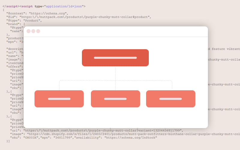
The URLs should be comprehensive and easy to read for both humans and search engines. In other words, use readable words instead of ID numbers. One of Shopify's built-in SEO features is that the URLs have readable structures and use standard characters.
-
If necessary, use punctuation to make your URLs more comprehensive (e.g., https://yourshopifywebsite.com/pages/shoes/womens-oxford-shoes is better than https://yourshopifywebsite.com/pages/shoes/womensoxfordshoes). It is better to use hyphens (“-”) instead of underscores (“_”).
-
Ensure that your URLs contain keywords but avoid keyword stuffing. Otherwise, your URLs will look spammy.
-
It is best to keep your URLs below 60 characters (including symbols like “-”). Longer URLs are more difficult to parse and cannot be entirely displayed on the SERPs.
- Avoid using stop (or filler) words (e.g., “and”, “the”, “a”, “an”, "if" etc.) in your URLs - they do not add any value to your URLs, take up space and distract readers.
The bottom line is...
Your URL structure should follow your page hierarchy. You should keep your URLs short, comprehensive, relevant, and to the point.
Creating an intuitive navigation structure is essential to providing a good user experience. It is also an integral part of structural SEO.
There are many types of website navigation: header menus, drop-down menus, hamburger menus, sidebars, footers, and breadcrumbs (or breadcrumb trails), to name a few. Let’s take a closer look at each of these navigation menus or solutions.
Header menus
When people first open a website, they want to know what the website offers and how they can find it. This is what the header menu is for. In other words, it should list your main category pages. If you see fit, you can also add links to other important pages on your website (e.g., “On Sale,” “New,” “About,” “Contact us,” etc.).
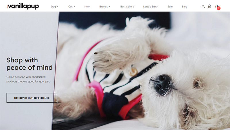
Shop Vanillapup is an online pet store built on Shopify. Their header menu is simple and clean. It immediately becomes clear that they offer products for dogs and cats, and that they offer different brands. In addition, buyers can see all new arrivals, best-selling products, or products that are on sale in a single click. Intuitive, simple, and clean - this is the type of header menu you should create.
Best practices:
- Your header menu should be visible at all times. In other words, it should be sitewide, as well as displayed through each scrolling phase. This way your customers can easily navigate your website. For example, they can switch categories, or see your contact information without having to scroll or change pages.
-
Keep your code clean.
- Avoid image-based menus. While they enable a more engaging and immersive shopping experience, they’re not compatible with all devices. In addition, they are not what you would call “an SEO-friendly solution.” Search engines cannot “see” images which means that it is more difficult for them to understand image-based navigation. Thus, text links that contain keywords have more SEO weight.
- Your menu titles should describe the content of their pages. In other words, the text links should match the titles of the pages they link to.
- Your menu items should be organized in a logical way that enables intuitive navigation.
Drop-down menus
Use drop-down menus to list your subcategories. Let’s use Vanillapup’s menu as an example again.
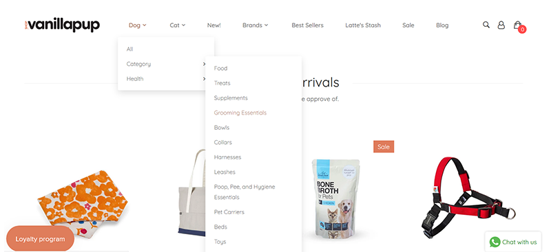
So, we have the main product categories in the header menu. It is obvious that some of these categories (“Dog,” “Cat,” and “Brands”) have subcategories (notice the down arrowhead symbols - “⌄”). When you hover over one of these categories, a drop-down menu (which contains subcategories) appears. This combination of a header menu (which lists the main categories) and drop-down menus (which list the subcategories) enables easier navigation and a better user experience.
For example, I am a proud owner of a very sweet (and extremely hairy) caucasian shepherd. As you can imagine, I use a variety of brushes and deshedding tools. It literally took me 3 seconds to find them on Vanillapup’s website. I hovered over “Dog” and two subcategories appeared - “Category” and “Health.” Naturally, I hovered over “Category,” and there they were - the “Grooming Essentials” I (so desperately) need! And if I want to find fish oil supplements for his bones, all I have to do is hover over “Health” and click “Hip & Joint.”
The organization of the subcategories in the “Cat” category is just as intuitive and logical. And if a pet owner wants to buy something from their favorite brand, all they have to do is hover over “Brands” and a list of all brands Vanillapup offers will appear.

Hamburger menus
The Hamburger menu is a menu icon comprised of 3 horizontal lines. When you click on it, it opens a menu that contains navigation buttons or links. The biggest advantage of hamburger menus is that they make it easier for users to navigate websites on their mobile devices.
For example, this is how Net-a-Porter’s homepage looks on my desktop computer.
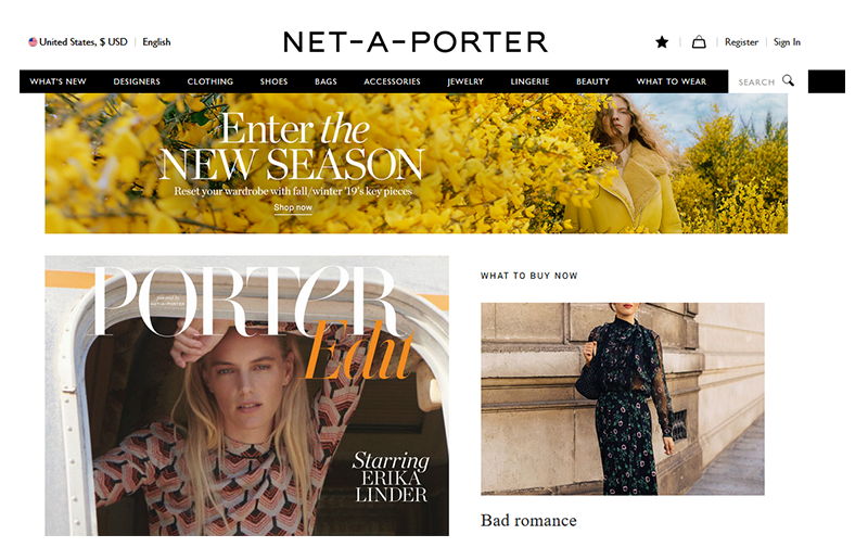
Take a look at the header menu. It contains ten text-based links. As you can imagine, this menu cannot possibly be displayed on the screen of a mobile device as it is.
So, Net-a-Porter uses a hamburger menu instead (top left corner).

When you click on the hamburger menu icon, a secondary navigation menu appears. It contains all links from the header menu (displayed on desktop devices).

Great design and a stellar mobile shopping experience. What more could you possibly want?
Sidebars (or Sidebar menus)
The purpose of the sidebar menu is to help customers find what they want faster. For example, take a look at the sidebar menu of Net-a-Porter’s Clothing category.
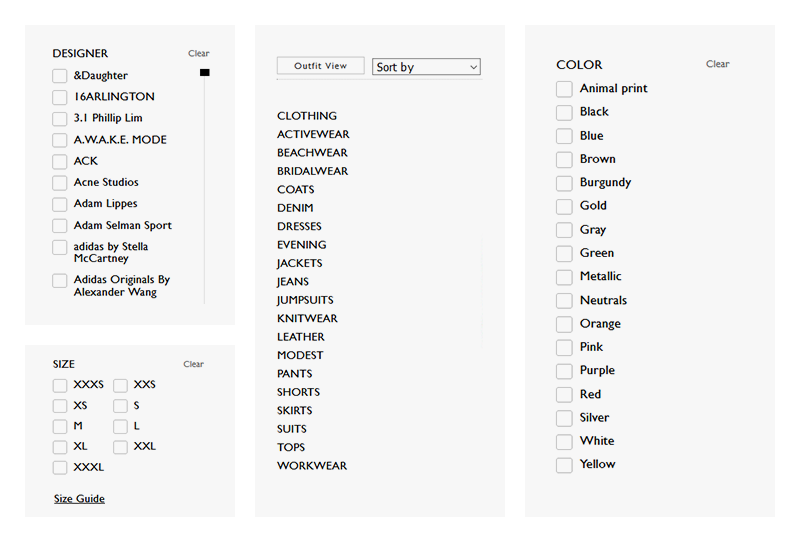
The first thing the sidebar allows you to do is choose whether you want to see plain product photos or product photos from a photo shoot, i.e,. a photo where a model poses wearing the product. (Notice the “Outfit View” button at the top of the sidebar menu. You can switch it to “Product view”).
Next, you can sort the products based on their arrival dates or prices. You can do this from the “Sort by” drop-down menu.
Next, you will see all clothing categories - “Activewear,” “Beachwear,” “Bridalwear,” “Coats,” “Denim,” “Dresses,” “Evening,” “Jackets,” “Jeans,” “Jumpsuits,” “Knitwear,” “Leather,” “Modest,” “Pants,” “Shorts,” “Skirts,” “Tops,” and “Workwear.”
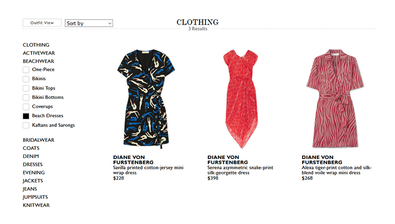
Each of these categories, has subcategories. For example, if you click on “Beachwear” you will see 7 subcategories: “One-piece,” “Bikinis,” “Bikini tops,” “Bikini bottoms,” “Coverups,” “Beach Dresses,” and “Kaftans and Sarongs.” Each of these subcategories can be used as a filter to your search. For example, if I’m only interested in beach dresses, all I have to do is mark the “Beach Dresses” checkbox and I will see all 237 beach dresses Net-a-Porter offers.

Next, you will see a menu of all designer brands Net-a-Porter offers. These too can be used as filters. For example, if I’m looking for beach dresses by a specific designer, say Diane von Furstenberg, all I have to do is mark the Diane von Furstenberg checkbox and I will see a list of all Diane von Furstenberg beach dresses Net-a-Porter offers.
You can mark multiple checkboxes to broaden your search.
Below the “Designers” menu, you will see two other menus that allow you to filter the products based on their color and size. For example, if I mark the “Blue” checkbox (from the “Color” menu) and the “S” checkbox (from the “Size” menu), I will narrow down my search to “Blue beach dresses designed by Diane von Furstenberg that are available in size S.”
To sum up, you can use your sidebar menu to provide a variety of filtering and sorting options - categories, subcategories, designers or brands, colors, sizes, and more.
Footers (or Footer menus)
The footer is a sitewide directory of links located at the bottom of your pages. As such, it should contain useful links, i.e., your contact information, or information your customers may need in order to complete their checkout, etc. But you should also use it to optimize your sales funnel and add links to the pages that have a direct impact on your bottom line (such as your category pages, for example).
Take a look at Net-a-Porter’s footer.

It contains 15 links:
- Customer Care 24/7 - an easy-to-reach contact form
-
Delivery, Exchange & Returns, Payment, Terms & Conditions, Privacy Policy, Cookie Policy, FAQs - useful information online shoppers need before placing an order
-
Gift Cards - this is another example of a page that can directly impact your bottom line
-
About Us, Careers, Affiliates, Advertising, NET SUSTAIN, Our Apps - information about Net-a-Porter, their mission, affiliate program, and more
Net-a-Porter’s footer also contains a newsletter sign-up form.
Now, take a look at Etam’s footer menu.

It contains 16 links divided into 3 categories:
- My order: Track your order, Delivery, and Return Information. If you offer order tracking, it is a great idea to include a link to the tracking system in the footer.
-
Services: Size Guide, FAQs, Contact us, Site Map, Student Discount, Privacy Policy, Cookie settings. If you sell clothing, including a link to your size guide in the footer will help you deliver a more informed shopping experience, which will increase your sales.
-
About us: Our Story, Know How, Etam Stores, Etam Group, Careers, Press. If you have physical stores, it is a good idea to include information about their geolocation in your footer.
Like Net-a-Porter’s footer, Etam’s footer also contains a newsletter sign-up form. However, Etam offers an incentive to get customers to subscribe: “Sing up to our newsletter to receive promos and special offers from Etam Paris.” Offering an incentive is better than simply saying “Stay in touch,” or “Be the first to learn about our new arrivals.” You can even use a more enticing offer like “Sign up to our newsletter and get 10% off your first order.”
Etam’s footer also contains links to their social media profiles, a simple, yet effective CTA (“Follow us”), as well as information about the different payment methods they offer.
Ultimately, both footers are great examples for how the footer of an e-commerce website should look. So, examine them. Learn from them. See what applies to your website. Make good use of your footer space.
Breadcrumbs (or breadcrum trails)
This is a breadcrumb trail.

This trail shows me exactly where I am in the website’s hierarchy - Midi & Maxi dresses. It also shows me all parent categories of the page I am currently on - “Dresses,” “Shop by category,” “Clothing,” “Home.”
Every higher-level page in the breadcrumb trail is clickable. Which means that I can go back to the homepage, or the “Shop by product” section in a single click. Convenient, right?
So, breadcrumbs help customers navigate your website and reach higher-level pages more easily. They also help search engines define the hierarchical order (i.e., the importance) of your pages which can help them prioritize the order in which they crawl them (which is another great way to maximize your Crawl Budget).
Simply put, using breadcrumbs will make your website more accessible, comprehensive and appealing to both users and search engines.
Best practices:
- Breadcrumb trails are a form of secondary navigation. As such, they should not be considered as a substitute to your primary navigation.
-
Use a smaller font and a subtle color for your breadcrumbs. It should be clear that the breadcrumb navigation is a secondary navigation. (See how Etam designed their breadcrumb trail - they used pale grey letters as opposed to the bold black font they used for the header menu.)
-
Breadcrumb navigation reads from left to right and it should progress from highest to lowest level.
-
The breadcrumb trail should include the full navigational path. In other words, do not omit any categories or subcategories.
-
The breadcrumb titles should match the titles of your pages.
-
Design your breadcrumb trails with your customers in mind. Typically, the different links in the breadcrumb trail are separated by “>”. However, if you think that “/” or “l” will be more appealing to your customers, or will match the design of your Shopify website better, use “/” or “l” instead.
To sum up, breadcrumbs make it easier for your customers to navigate your website and, therefore, enhance your customers' shopping experiences. They also help search engines crawl your website faster and more efficiently.
The bottom line is...
Creating an intuitive navigation structure is essential. It will help you provide a better shopping experience for your customers and will maximize your Crawl Budget. This will result in more sales opportunities and better search engine rankings for your high-priority pages.
Wrap-up
Ultimately, your website architecture is how your homepage, categories, subcategories, product pages and other web pages are organized and linked together.
You need to create and design your website architecture with both your customers and search engines in mind. In other words, your goal is to create a website that is easy to navigate for both humans and search engines.
To create such website architecture you need to create a low-depth website hierarchy, a logical URL structure, and an intuitive website navigation structure.
I hope this guide gave you a better understanding of how you can do this. If you have further questions, or want to share your experience, just leave a comment below.


Yes, Shopify Website design enhancement works on the amount and nature of users to the Shopify store through organic search engines like Bing and Google. Shopify SEO Web optimization helps the search engine to index the website’s higher rank and gaining more trust and engagement from the visitors. Shopify SEO services are in demand and it helps to increase online business profit. Thanks for the blog from SynergyTop