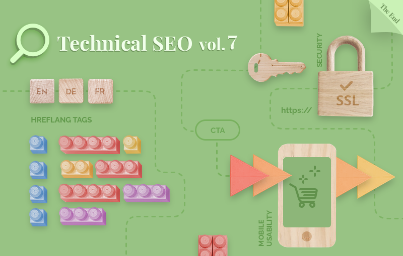
Today, we’ll cover several different, but equally important, technical SEO topics: website security, mobile usability, and hreflang tags. Let’s dive right in!
Overview
- Website security: Everything you need to know about SSL and Shopify
- Mobile usability: 10+ ways to deliver a stellar mobile shopping experience
- Hreflang tags: What are they, why are they important, and how to implement them?
- Wrap-up
Website security: Everything you need to know about SSL and Shopify
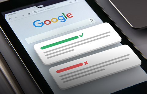
SSL (Secure Socket Layer) is a protocol for encrypting Internet traffic and verifying server identity. An SSL certificate is a data file hosted in a website’s origin server.
Source: Cloudflare
Why are SSL certificates important?
SSL certificates are essential because they encrypt your Shopify store’s content (including your customers’ personal information) and add a new layer of security to your website (by publishing the content using HTTPs instead of HTTP). As a result, they build customer trust, facilitate your customers’ buying decisions, and boost sales.
In addition, SSL certificates are good for SEO - they are a trust signal which means that websites with an SSL certificate have a competitive advantage against websites that don’t.
How to enable SSL for your Shopify store?
SSL certificates are created automatically when you add your custom domain. They are activated by default for your Shopify store’s checkout and all assets (e.g., images, videos, web fonts, etc.) hosted on your Shopify-managed domain, i.e., your .myshopify.com domain.
Also, an SSL certificate can be issued automatically when you connect a third-party domain to Shopify. For this to happen, you must add the correct information to the A record and CNAME record. Note that the process may take up to 48 hours. During this time, an SSL unavailable error might be displayed in your Shopify admin. Also, a warning message (e.g., “Your connection is not secure”) may be displayed in your public storefront.
What to do if the SSL unavailable error is still displayed after 48 hours?
- Verify that your A record is 23.227.38.65 (Shopify’s IP address) and your CNAME record is shops.myshopify.com.
- If you use CAA records, verify that you have added all the required certification authorities for digicert.com, globalsign.com, and letsencrypt.org.
- If you use an AAAA (IPv6) record, remove it - they’re irrelevant to Shopify’s web hosting.
- If you have DNSSEC enabled for your domain, disable it.
Learn more: Enabling secure connections to your Shopify store
How to ensure that your assets stay secure?
The best practice is to host all your assets on Shopify. If you host them outside of Shopify, they must be delivered over HTTPs, i.e., you must host them on a server that publishes over HTTPs. Also, you must host all video content on a service that publishes over HTTPs, and verify that all fonts you use are published over HTTPs from their source.
This is important because pages that contain unencrypted content cause mixed content errors. These pages are still publicly accessible, but their URLs don’t contain a padlock icon and aren’t delivered through https://. This may undermine your credibility.

Important
All content and assets hosted outside of Shopify, can’t be updated automatically when you activate your SSL certificate in your Shopify admin. You’ll need to update them manually. Note that for some content types, you’ll need to edit the source HTML and set the path to HTTPS instead of HTTP. If you’re not a developer, it is best to outsource the task to a Shopify Expert.
Learn more: Shopify, Enabling secure connections to your Shopify store
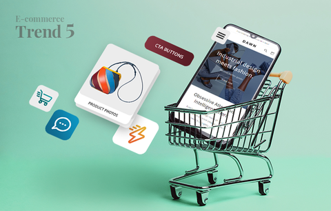
Mobile usability: 10+ ways to deliver a stellar mobile shopping experience
2021 Mobile Commerce Stats
- 72.9% of all e-commerce will be m-commerce by the end of 2021 (Source: Statista). This is a massive rise from 58.9% in 2017.
- In 2020, US mobile retail revenue was $339.03 billion.
- Mobile commerce sales will reach $3.56 trillion by the end of 2021 (Source: Statista). This accounts for an increase of over 22.3% of the total sales reported for 2020 – $2.91 trillion. M-commerce growth statistics show that since 2016, m-commerce has seen an average increase of 33.8% yearly.
- 79% of smartphone users have made a purchase online using their mobile devices (Source: OuterBox). That’s close to a billion people worldwide!
- 76% of consumers shop on mobile devices because it saves time (Source: Dynamic Yield).
Source: Tech Jury
If you want to keep up with these numbers, responsiveness alone is not enough. You must deliver an outstanding mobile shopping experience. This will increase the rate of user attraction and customer acquisition, boost customer engagement and satisfaction, build brand loyalty, and, ultimately, drive more conversions.
In this section, we’ll show you how to optimize your Shopify store for mobile and deliver a stellar mobile shopping experience.
#1. Think mobile-first
Only 12% of consumers find mobile shopping convenient (Source: Dynamic Yield). The issues shoppers face include websites not designed with small screens in mind, pop-ups and intrusive ads, lack of information, and more. Also, when people have a negative brand experience on mobile, they are over 60% less likely to become repeat buyers (Source: Tech Jury).
Smartphones are redefining what consumers expect from online shopping. Today, people expect a certain type of functionality that is tailored to mobile. To exceed their expectations, you must go beyond responsive design. You need to start thinking mobile-first.
What does this mean?
Responsive design means that the content of a website is designed to fit on different screens. Usually, the process involves designing for desktop first. As a result, the mobile version of a website may be a bit clumsy. For example, some images (especially infographics) may not look so good, some pages may load slower, the checkout process may be too complex, and more.
Mobile-first design involves designing for mobile browsing first. As a result, the mobile shopping experience is seamless leading to a lower bounce rate, higher customer satisfaction levels, and more conversions.
To sum up, responsive design involves designing for desktop and adapting for mobile. Mobile-first design involves designing for mobile devices first and adapting for desktop.
8+ mobile-first design principles
- Minimize the use of text. Ensure your formatting is clear and the content is easy to scan.
- Select a font that is easy to read on a smaller screen. Google recommends a base font size of 16 CSS pixels.
- Reduce the number of links in the navigation menu.
- Keep your borders wide and lines clean.
- Implement interactive elements.
- Ensure all elements (such as buttons, links, live chat icons, etc.) are easily clickable - customers shouldn’t have to zoom in to be able to click on a button.
- Optimize your Shopify store for the “Thumb Zone” - the surface area people can easily reach with their thumbs. The term “Thumb Zone” was coined by Steven Hoober (a UX researcher and expert) who conducted a study to analyze how different people hold and use their mobile devices. According to the study 49% of users depend on a single-hand grip for device support, and 75% interact with their mobile devices using just their thumbs. Learn more: Smashing Magazine, The Thumb Zone: Designing For Mobile Users

How to optimize your Shopify store for the "Thumb Zone"?
- Important components (e.g., the navigation menu, CTA buttons, the shopping cart button, the checkout button, etc.) should be positioned in the “Thumb Zone.”
- Spacing is important. There should be enough space between the different elements on the page - this minimizes the risk of users clicking on buttons or links they don’t want to click on.
- All clickable elements (e.g., buttons, links, tags, images, etc.) should be large enough to be tapped with a thumb.
- Consider both right-handed and left-handed users.
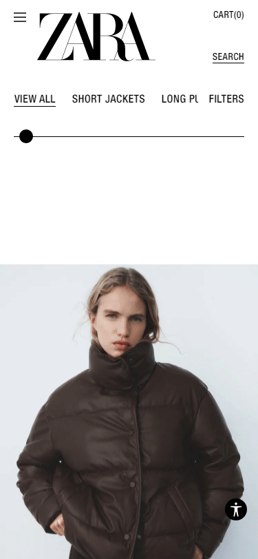
- Think vertically. Arrange your products in a way that delivers a delightful shopping experience on mobile. For example, arrange your products in columns. The best practice is to keep the number of columns under two. Get inspired by ZARA’s beautiful mobile design:
To check the layout of your Shopify store from a mobile standpoint:
- Open your website using Google Chrome.
- Click Ctrl + Shift + C. This will open the developer console.
- Click on the mobile screen icon.

Keep learning: Make your Shopify Mobile Store Look Better | Quick Shopify Tips 2021
#2. Ensure your Shopify store loads fast on mobile devices
The probability of bounce increases by 32% if mobile page load time goes from 1 second to 3 seconds (Source: Google).
We already discussed the importance of having a fast-loading website in our guide to page speed optimization for Shopify. Customers are impatient - when shopping online, they want to find what they need quickly and easily. This is especially true for mobile browsing since people usually use their phones on the go.
To ensure your Shopify store loads fast on mobile devices:
- Optimize your content for search intent & ensure you include only relevant information.
- Use HTML localStorage specification or automated mobile acceleration solutions.
- Ensure your images are the appropriate size and resolution to fit on mobile screens.
- Avoid using pop-ups. Even though they’re great for capturing emails and promoting sales, they’re difficult to close on mobile screens. This may hinder the shopping experience and frustrate your customers. Besides, they can negatively impact your page speed.
- Avoid using sidebars - they’re distracting, take up too much screen “real estate,” and can negatively impact the user experience on mobile. Also, they can slow down your pages.
#3. Optimize your navigation
When we use our phones, we’re constantly scrolling, swiping, tapping, etc. Everything happens quickly and in swift motions. This is why it’s important that all essential page elements and business-critical information are always on the screen. You can achieve this by integrating a fixed navigation bar into your design. Your fixed navigation bar should contain a CTA button, a link to your homepage, a link to the shopping cart page, and a link to the checkout page.
To deliver a better mobile shopping experience, you should simplify your navigation. More specifically, you should:
- Reduce the number of navigational layers - on mobile, it is easy to get lost amongst a myriad of categories, subcategories, filters, tags, etc. The more complicated your navigation is, the higher the chances are that consumers will leave. So, keep it simple and stick to one level of nested content.
- Use a mobile-friendly menu alternative (e.g., hamburger, carer, or three dots menus). This will save space and help you deliver a better shopping experience.
Here’s an example of a hamburger menu:

When you click on the hamburger menu icon, a secondary navigation menu appears. It contains all links from the header menu (displayed on desktop devices).

#4. Keep important elements above the fold
Your logo, navigation menu, CTA button, shopping cart, and checkout button must be above the fold. This will help you deliver a more informed mobile shopping experience and create a smooth conversion path (with a limited number of actions).
#5. Consider how you use text
Mobile devices have a limited screen space. This means that you must present all essential product information in a concise, yet engaging manner. One way to achieve this is to minimize text and let your product photos do the talking. For example, your copy can be limited to your product name, product variant, price, a CTA button, and a short product description. You can use a collapsible menu that includes additional product information. To facilitate your customers’ buying decisions, you can use images to showcase all product features and characteristics. Get inspired:

Image source: ZARA
Also, text should be easy to read. Remember that a customer shouldn’t have to zoom in to read your product descriptions. The best practice is to choose a UX-friendly font that is between 14 and 16 pixels.
Last but not least, text and images should not overlap. Even though this may look good on a desktop computer or a laptop, it will be difficult to read on smaller screens. There is a risk that your customers will get frustrated and leave.
#6. Position your product photography front and centre
Mobile shopping is a visual experience. We already pointed out that the use of text should be minimal. In this section, we’ll explain exactly how you can leverage product photos and use them in a way that delights your customers, answers their most burning questions, and drives sales.
First and foremost, product photos should be the focal point of your product and category pages.
For example:
- Category page - Simple and sophisticated grid of beautiful product photos & limited copy. This is a perfect example of how visuals can simplify the website’s navigation and facilitate the decision making process.

- Product page - Beautifully designed and easy to navigate photo carousel that displays the best product features and showcases the product from different angles.

Source: Frank & Oak
Second, use real product photos. In this way, you’ll be able to showcase the product features in a highly authentic manner. It is best to include photos that showcase the product in different settings - a neutral background (the classic product photo), a model wearing the product (if it is a piece of clothing or an accessory), showing the product in use (if it is an appliance, a tool), etc. If you have product variants, use real photos for each variant - this will help you deliver a more informed and seamless shopping experience that emulates the experience of shopping in a brick-and-mortar store. For example, people won’t have to wonder how a particular item looks in a different color. This will build confidence in your products and help you turn hesitant shoppers into first-time buyers. Also, it will reduce the number of returns which will save you time and money.
#7. Optimize your CTA buttons for mobile
Your CTA buttons should be:
- Prominently placed above the fold and visible at all times. This is a way to constantly remind your customers to take action in an effective and non-intrusive manner. It is best to use a contrasting color that matches the overall aesthetics of your website - in this way the button will instantly catch your customers’ attention, but it won’t look awkward, intrusive, or out of place. Get inspired: Scotch & Soda

- Easy to tap, i.e., customers shouldn’t have to zoom in to add items to their carts. The best practice is to design buttons that are large enough to be tapped with a thumb. Also, there should be enough space between the different tap targets, so that a customer doesn’t accidentally tap a button they don’t wish to.
- Your CTA copy should be straightforward (e.g., “Add to Cart,” “Buy Now,” etc.).
#8. Simplify mobile form interactions
Complicated or long forms cause frustration and are a common reason for cart abandonment. To optimize your forms for mobile:
- Remove all unnecessary fields.
- Create descriptive form labels.
- Disable autocorrect on the “Name” and “Address” fields.
- There are many things to consider in terms of spacing between the different fields. On the one hand, customers should be able to fill in each field with ease (using their fingers). On the other, more space requires more scrolling which could hurt the overall user experience. Test different options to find the balance.
- Form fields should be in the “Thumb Zone.”
- The keyboard should automatically adjust to the field types. For example, you should have an alphabetical keypad for the “Name,” “Email,” and “Address” fields, and a numerical keypad for the “Phone number” and “Credit card information” fields.
#9. Optimize your checkout for mobile
Mobile shopping carts have an abandonment rate of 85.65% (Source: Barilliance). A complicated checkout process is one of the most common reasons for cart abandonment. This is why it’s important to optimize your checkout for mobile. To do this:
- Reduce the number of steps a customer has to go through, and the number of fields they need to fill in. Ask for relevant information only. The less your customers need to type, the higher the chances are they’ll complete their checkout.
- Place the checkout button above the fold. Ensure it is large enough to be tapped with a thumb. Use contrasting colors and a clear CTA. Note: In Shopify, you can personalize your buttons. For example, you can create dynamic checkout buttons and deliver a swift and seamless checkout experience.
- Integrate payment gateways.
- Offer a guest checkout option. More often than not, people are in a hurry to place an order. Or they don’t want to register. Or, maybe, they’re not 100% sure they want to place an order and any unnecessary step they have to go through, is a reason for them to abandon their cart. Offering a guest checkout option will help these impatient and hesitant buyers convert.
#10. Test
Use Google’s Mobile-Friendly Test to check if your Shopify store is mobile-friendly. Just enter your URL in the “Enter a URL to test” field and click “Test URL.” Also, you can test code snippets.
Use Google Search Console’s Mobile Usability Report to check your website for mobile usability issues.
#11. Ask for help
If you’re not a developer and find it difficult to implement these changes yourself, we strongly advise you to contact a Shopify Expert who can optimize your Shopify store for mobile.
If you have a multilingual Shopify store, it’s essential to implement hreflang tags. Hreflang tags help Google (and other search engines) determine the language and region the website is intended for. Using this information, they serve the correct URL based on the user’s language and location.
Why is this important?
Say you have several language versions of your store:
- German (https://www.yourshopifystore.com/de/)
- French (https://www.yourshopifystore.com/fr/)
- Spanish (https://www.yourshopifystore.com/es/)
- And more
By including hreflang tags in your theme code, you ensure that a customer located in Germany or with a German language setting will be served the German URL, a customer located in France or with a French language setting will be served the French URL, etc. This will help you deliver a more relevant and personalized shopping experience, which will reduce your bounce rate and positively impact your bottom line.
What exactly are hreflang tags?
Hreflang tags are HTML attributes placed on <link> elements. They identify a localized website URL. Each language or region URL must have a unique hreflang tag - you can include as many hreflang tags as you need to specify that a particular page has multiple versions. Hreflang tags must be included in the <head></head> section of your Shopify theme.liquid.

Source: Shopify .dev
As you can see, this code snippet contains three different attributes:
- rel - This attribute tells search engines how the page relates to other pages in your Shopify store (“alternate” means that the page is a variation of another page, i.e., it tells Google that the page could be similar or identical to other pages). This is important from an international SEO perspective as it prevents region or language-specific pages from creating duplicate content issues.

Important
Hreflang tags are different from canonical tags.
A canonical tag tells Google which URL is the dominant or preferred URL. Learn more about canonical tags: How to Fix Duplicate Content Issues in Shopify?
Hreflang tags tell Google which localized version of the page should appear on the SERPs based on the user’s location or language. Note: Hreflang works at page-level, not domain-level. The “rel” attribute defines ‘alternate pages,’ not ‘alternate websites.’
- hreflang - This attribute specifies the language and region the page is intended for. The value set for the hreflang attribute always begins with the language. It’s absolutely necessary to specify the language. Specifying the region is optional. Important: You must specify the language in ISO 639-1 format. The region must be specified in ISO 3166-1 Alpha 2 format. The language and country codes must be separated by a dash (“-”), not an underscore (“_”).
- href - This attribute specifies the page.
At first glance, hreflang tags seem pretty straightforward. However, Google’s John Mueller describes them as “one of the most complex aspects of SEO (if not the most complex one).”
This is because hreflang tags are bidirectional - if page A links to page B, page B must also link to page A. Otherwise the hreflang tags may be ignored or not interpreted correctly. The more languages you sell in, the more complex this process gets. Also:
- Each page that has hreflang tags must also have a self-referencing hreflang tag.
- Hreflang tags must point to working pages, i.e., pages that return a 200 status code.
- Each attribute must be properly set up.
Ultimately, if you’re a skilled developer, implementing hreflang is simple. However, maintaining hreflang tags that meet these requirements is a challenge. Luckily, as a Shopify store owner, you don’t need to worry about this!
Shopify automatically implements hreflang tags: when you publish a language, Shopify creates unique URLs for each translated page in your website. This is done by adding the language code to the URLs (e.g., if you translate your store in German, Shopify will automatically create the https://www.yourshopifystore.com/de/ URL).
Also, Shopify automatically includes all published languages in sitemaps. This helps Google detect the different languages in your store. Learn more: Shopify Help Center, International domains
Who can benefit from these features?
All merchants on the Shopify plan, the Advanced Shopify plan, or the Shopify Plus plan, can use the international domains feature and have different languages available on different domains. Learn more: Shopify Help Center Selling in multiple languages, URLs and SEO
As you can see, Shopify does most of the heavy-lifting. All you need to do is choose an app that supports Shopify’s multi-language feature. One such app is Translation Lab.
Translation Lab works natively with Store Languages (Shopify’s multi-language feature). With Translation Lab, you can manually translate your checkout and every translatable resource (e.g., products, collections, blogs, pages, emails, meta fields, shops, links, product variants, etc.). Also, you can automatically translate your entire store in any language using Google Neural Machine Translations.
Other cool features include:
- Detect the preferred language of your customers and load your store in the most appropriate language.
- Place a customizable language switcher in your store.
- Sell in 160+ currencies.
- Translate product options in bulk.
- Export/Import translations.
- Change the default language of your store.
- Migrate your theme translations from one theme to another.
- And more!
Translation Lab has a free plan and three paid plans. Pricing starts from $9.99/month.
Keep learning about hreflang and selling in multiple languages:
- Shopify .dev, Use hreflang tags in your theme
- Google Search Central, Tell Google about localized versions of your page
Wrap-up
Today, we discussed three important technical SEO topics:
- Website security
- Mobile usability
- Hreflang tags
We tried to cover every topic in detail and hope this guide answered all your questions. Still, if you want to ask us anything, share your experience or thoughts, don’t hesitate to drop us a line!
This is the last guide of our technical SEO blog series. It has been an exciting journey! 28,950 words, give or take a few. Thank you for sticking with us for so long!
The next adventure awaits! We can’t wait to dive into 2022 with fresh ideas, meaningful content, exciting stories, and inspiring examples! Stay tuned!